How to design skincare packaging: a comprehensive guide for founders
Structural design, material choices, and premium positioning for independent skincare brands.

Ian Mora
Creative Director
Skincare packaging is the first product experience your customer ever has. Before the formula touches their skin, the bottle has already told them what kind of brand you are: clinical or sensorial, mass or considered, disposable or kept. For independent founders, packaging is one of the highest-leverage design decisions you'll make—and one of the easiest to over-spend or under-think.
This guide walks through the three pillars that decide whether a piece of skincare packaging works: structural design, material choices, and premium positioning. It's written for founders preparing a first launch or repositioning an existing line.
Start with structural design
Structure is the silhouette, the format, and the way the product is held, opened, and dispensed. It's set long before the label, and it carries more weight than most founders expect. A beautifully labelled bottle in the wrong format will still feel off; a quietly labelled one in the right format will feel inevitable.
Match format to use case
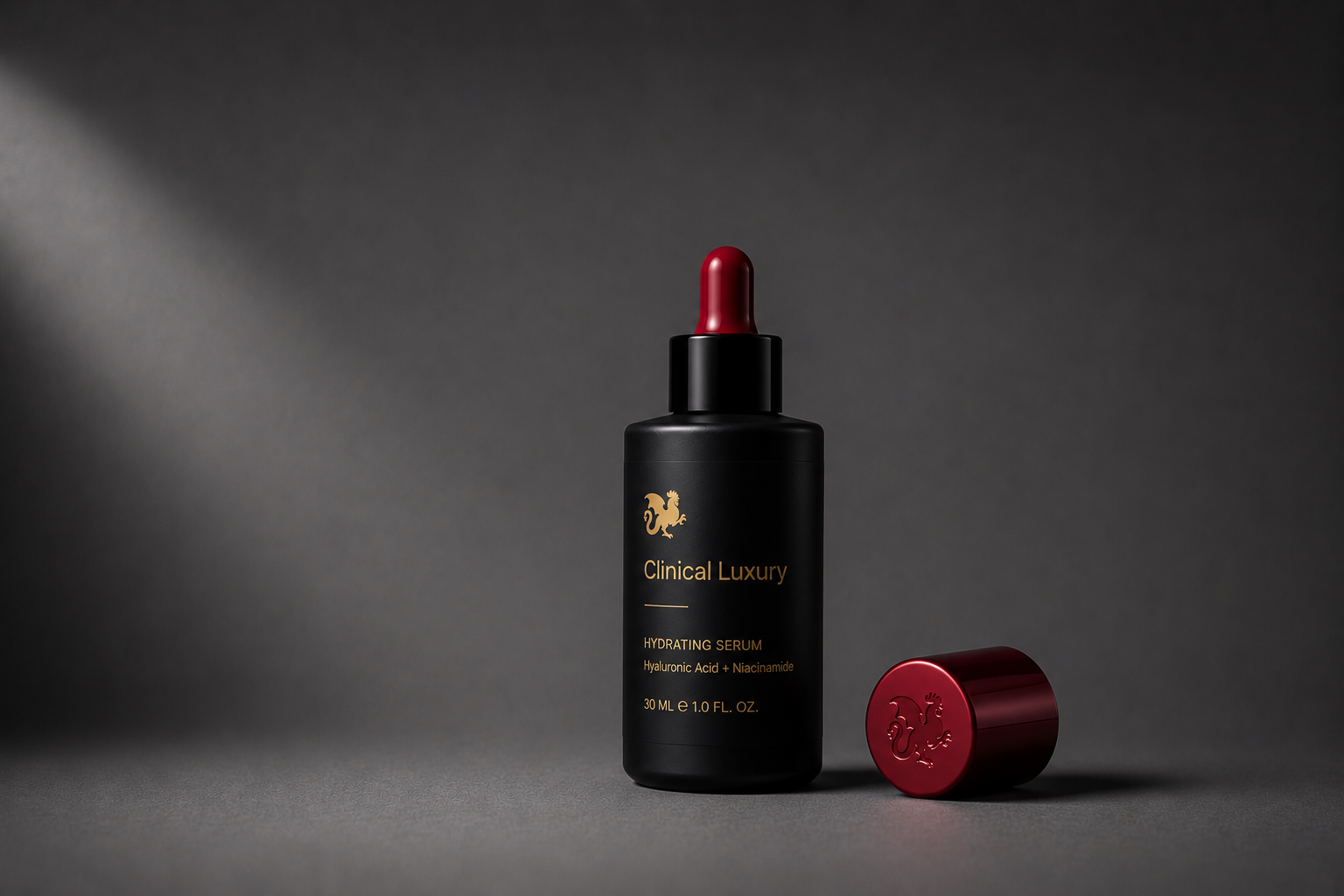
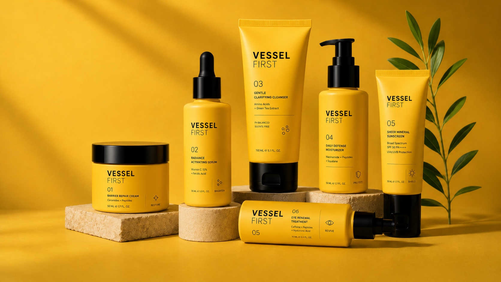
A serum lives on a vanity and gets used twice a day. A cleanser lives in the shower and gets used with wet hands. A travel size goes into a carry-on and gets tossed around. Each context implies a different format—dropper, pump, tube, jar, airless—and ignoring the context is how products get returned.
- Droppers signal precision and active ingredients—pair with serums, oils, and treatments where dosage matters.
- Pumps signal modern, hygienic everyday use—pair with lotions, moisturisers, and cleansers used with one hand.
- Tubes signal travel-friendly utility—pair with cleansers, masks, and lip products.
- Jars signal richness and ritual—pair with balms and creams, but plan for the hygiene tradeoff.
- Airless pumps signal clinical formulation integrity—pair with vitamin C, retinol, and peptides that oxidise.
Design the gesture, not just the object
Pick up your competitor's bottle and use it for a week. Notice the weight in your hand, how the cap unscrews, whether the pump primes on the first push, how the last 10% of the product comes out. Those small frictions are where loyalty is lost. Premium structural design isn't about being heavier or more elaborate—it's about removing the small annoyances customers can't name but absolutely feel.
Design for the shelf and the camera
Your packaging has to survive two very different stages: a crowded retail shelf where it competes against twenty other bottles at arm's length, and a 1080×1080 product tile on Instagram where it competes against everything. Silhouettes that read clearly at both scales tend to win—distinctive proportions, a strong shoulder, a recognisable cap. Avoid silhouettes that only photograph well from one angle.
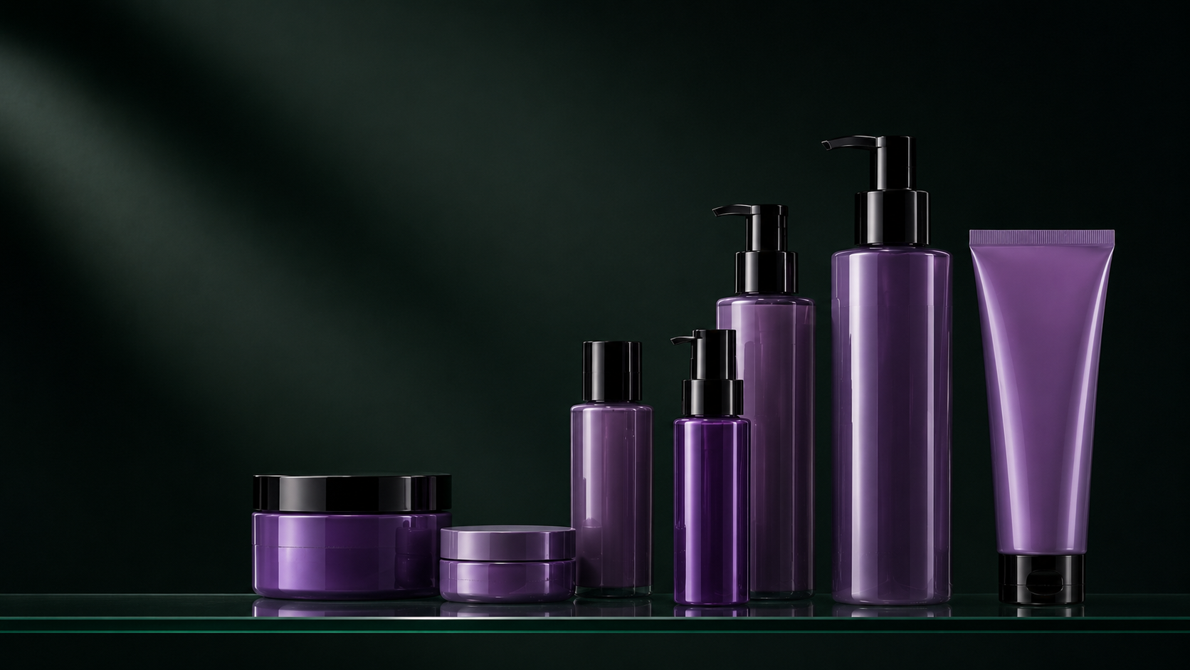
Choose materials with intent
Material is half the brand. Glass vs. plastic, frosted vs. clear, matte vs. gloss, paper vs. film—each choice carries an unspoken message about price, sustainability, and seriousness. Founders often default to whatever the contract manufacturer offers; the brands that stand out treat materials as an active design decision.
Glass
Glass reads as premium, clinical, and considered. It's heavier in the hand, more recyclable in most markets, and protects light-sensitive actives. The tradeoffs are cost, freight (heavier units cost more to ship), breakage in travel sizes, and a higher carbon footprint per unit if you don't ship locally. Use glass for hero products where the unboxing matters and the use case is at home.
PCR plastic
Post-consumer recycled (PCR) plastic is the most defensible plastic choice for skincare today. It's lighter than glass, ships cheaper, survives travel, and avoids the worst of virgin-plastic optics. Push for 100% PCR where the format allows; if your supplier only offers 30%, ask why. The number on the bottle is part of the brand story.
Aluminium and tin
Aluminium tubes and tins are having a moment for a reason: infinitely recyclable, lightweight, and visually distinctive in a sea of plastic. They suit balms, solid cleansers, and refillable systems. Watch for interior linings—an unlined aluminium tube can react with acidic formulations.
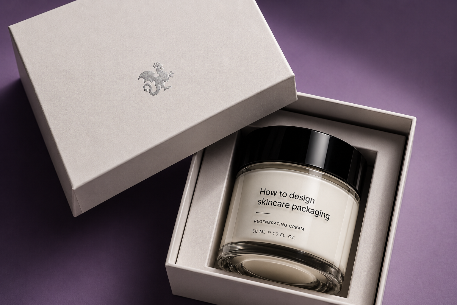
Secondary packaging
The outer carton is where most of your brand storytelling happens, and it's where small budget changes have outsized impact. Uncoated stock with soy ink reads differently from a glossy laminated box, even before the customer registers why. A simple deboss costs less than a foil stamp and often photographs better.
Position for premium, then design backwards
Premium isn't a finish—it's a coherence. A $90 serum that arrives in a wobbly carton with crooked labels and a fingerprint-magnet bottle isn't premium, no matter what the foil says. Decide where you want to sit on the shelf first, then make every packaging decision answer to that.
Pick a reference set, not a competitor
Don't benchmark against the brand directly above you in price—benchmark against the brand whose customer you want. If you want the Aesop customer, study Aesop's restraint, typography, and information hierarchy. If you want the Glossier customer, study their colour, softness, and conversational copy. Your packaging should feel like it belongs in that customer's bathroom before you launch.
Restraint reads as confidence
The most common mistake in founder-led skincare packaging is too much information on the front. Brand name, product name, three benefit claims, key ingredient, size, and a badge. Premium brands trust the customer to turn the bottle around. One word on the front, the rest on the back—that single edit changes how the product is perceived more than any material upgrade.
Sweat the typography
Type choice is the single biggest signal of brand quality on packaging. A custom or licensed serif costs $200–$2,000 and immediately separates you from every brand using free defaults. Pair one display face with one neutral text face, set ingredients in small caps, and use generous tracking on uppercase labels. Don't use more than two fonts.
- Use a tight, considered hierarchy—brand, product, descriptor, size.
- Keep INCI ingredient lists legible (minimum 6pt, high contrast) — it's a legal requirement in most markets.
- Set batch codes and expiry dates somewhere quiet but findable.
- Avoid centering everything by default; left-aligned labels usually feel more editorial.
Make it manufacturable
The best-designed packaging in the world is useless if your contract manufacturer can't fill it, your fulfilment partner can't ship it without damage, or your unit economics break at scale. Loop your supplier in early—before you finalise the structural design, not after.
- Confirm minimum order quantities (MOQs) for every custom component; bespoke caps and bottles often need 10,000+ units.
- Get a real freight quote based on your packed-out case dimensions, not just a per-unit cost.
- Order a full dieline mockup and live with it on your desk for two weeks before approving.
- Stress-test the shipper: drop it from a metre onto concrete with the product inside.
Sustainability as a design constraint
Sustainability claims are now scrutinised the way ingredient claims are. Vague language ("eco-friendly," "recyclable where facilities exist") reads as greenwashing. Specific, measurable choices read as credible: "100% PCR bottle," "aluminium cap, separate to recycle," "refill available at six weeks." Bake those constraints into the design from the first sketch—it's nearly impossible to retrofit them later.
The brands that endure aren't the ones with the loudest packaging—they're the ones where every decision, from the shoulder of the bottle to the weight of the carton, answers to the same idea. Design the idea first. The packaging follows.
Where to start
If you're at the start of a launch: lock the format and material before the label. If you're repositioning: audit the unboxing as a stranger would, and edit the front of the pack down to one idea. If you want a second pair of eyes on the system before you commit to tooling, we offer a paid packaging audit—structural review, material recommendations, and a positioning read in two weeks.
Author
Ian Mora
Founder of Artiphicial.com.