
Case study · 2023
Kovo
A bold yellow CBD skincare house that broke through the noise.
- Client
- Kovo
- Location
- New York, NY
- Services
- Brand IdentityPackaging
- Year
- 2023
Overview
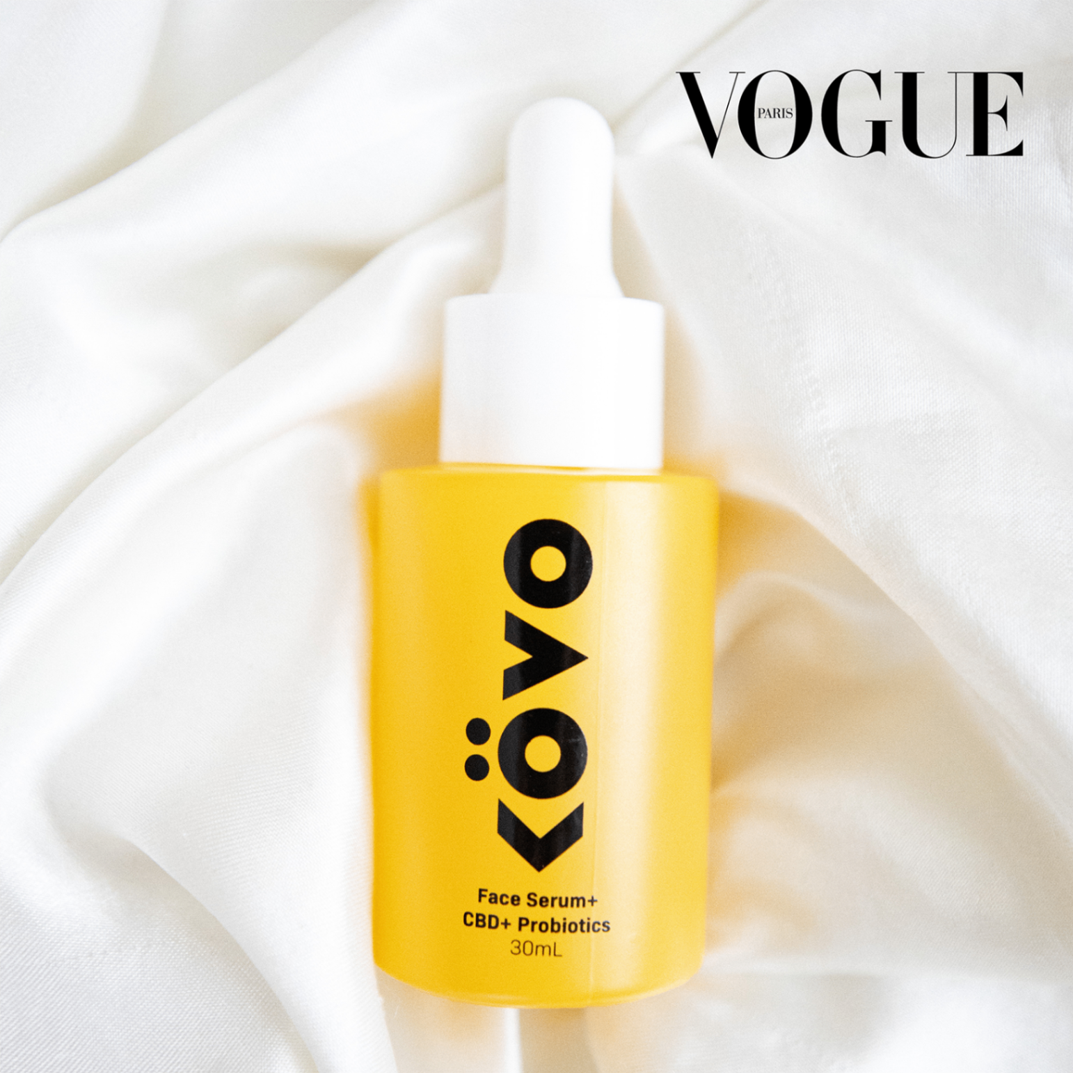
Kovo came to us as a premium NYC-based CBD skincare line entering one of the most crowded categories in beauty. We built a bold, Vessel-First packaging system in a single saturated yellow — distinctive enough to land them on the shelves of Sephora and directly in the pages of French Vogue.
The challenge
CBD skincare was flooded with hemp-leaf greens, apothecary minimalism, and look-alike wellness branding. To earn a spot at Sephora and credibility with editorial press, Kovo needed a system that felt unmistakably premium, unmistakably itself, and impossible to confuse with the rest of the shelf — at six paces, in a magazine spread, and on a phone screen.
Our approach
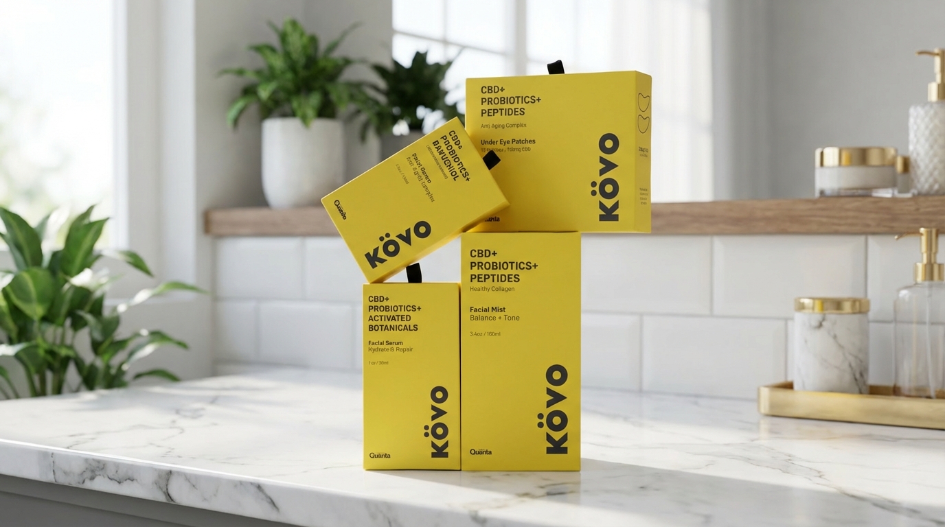
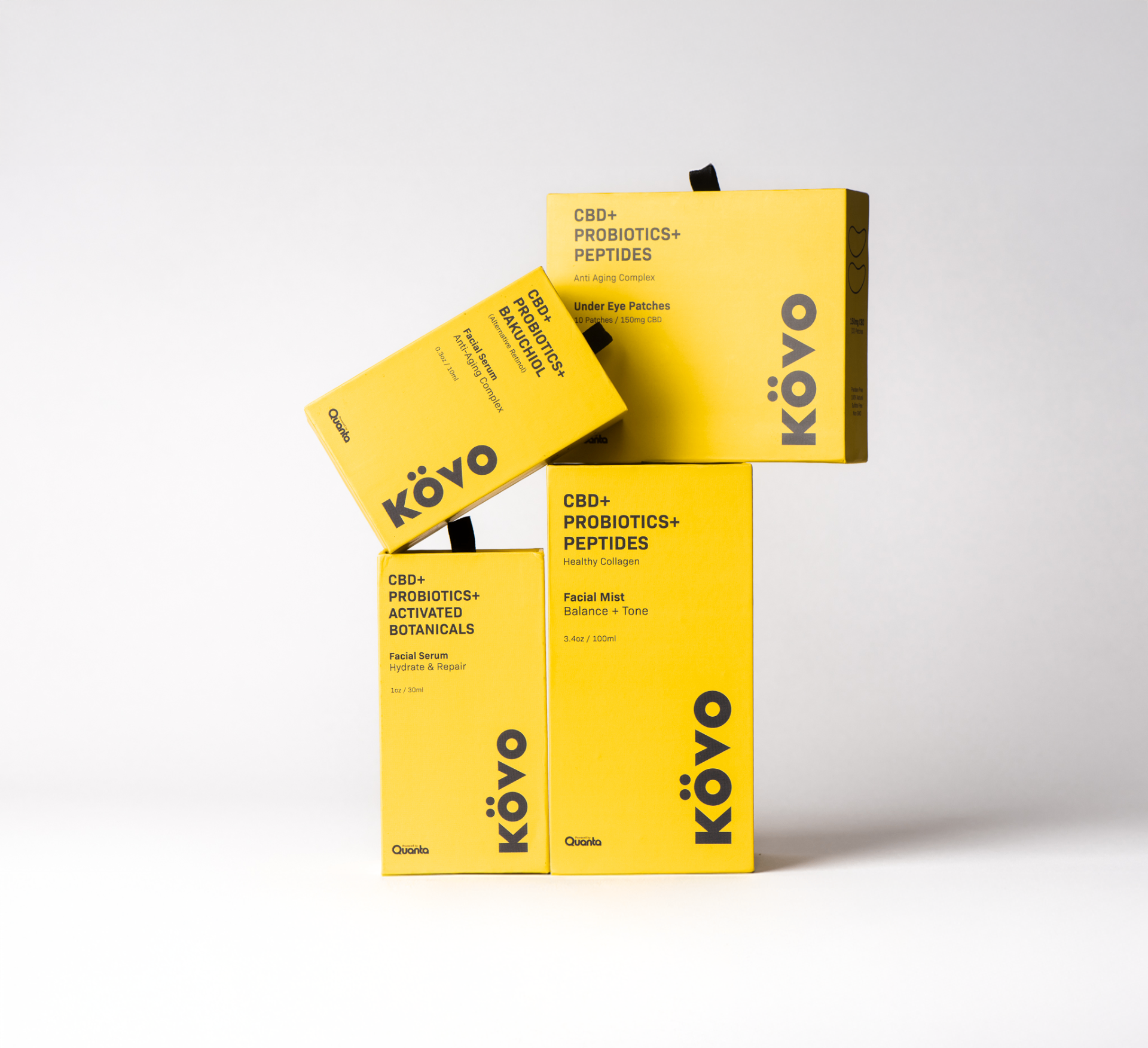
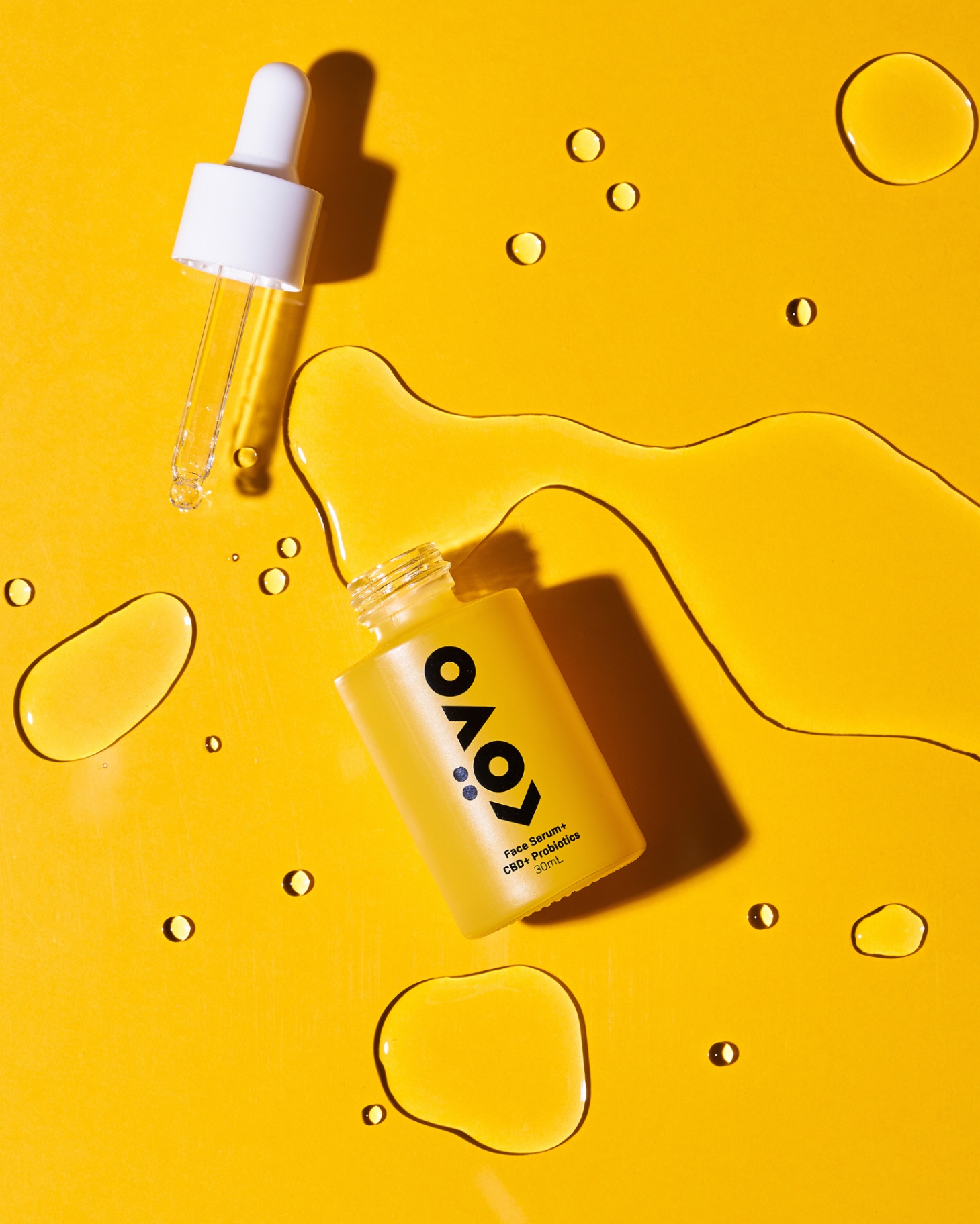
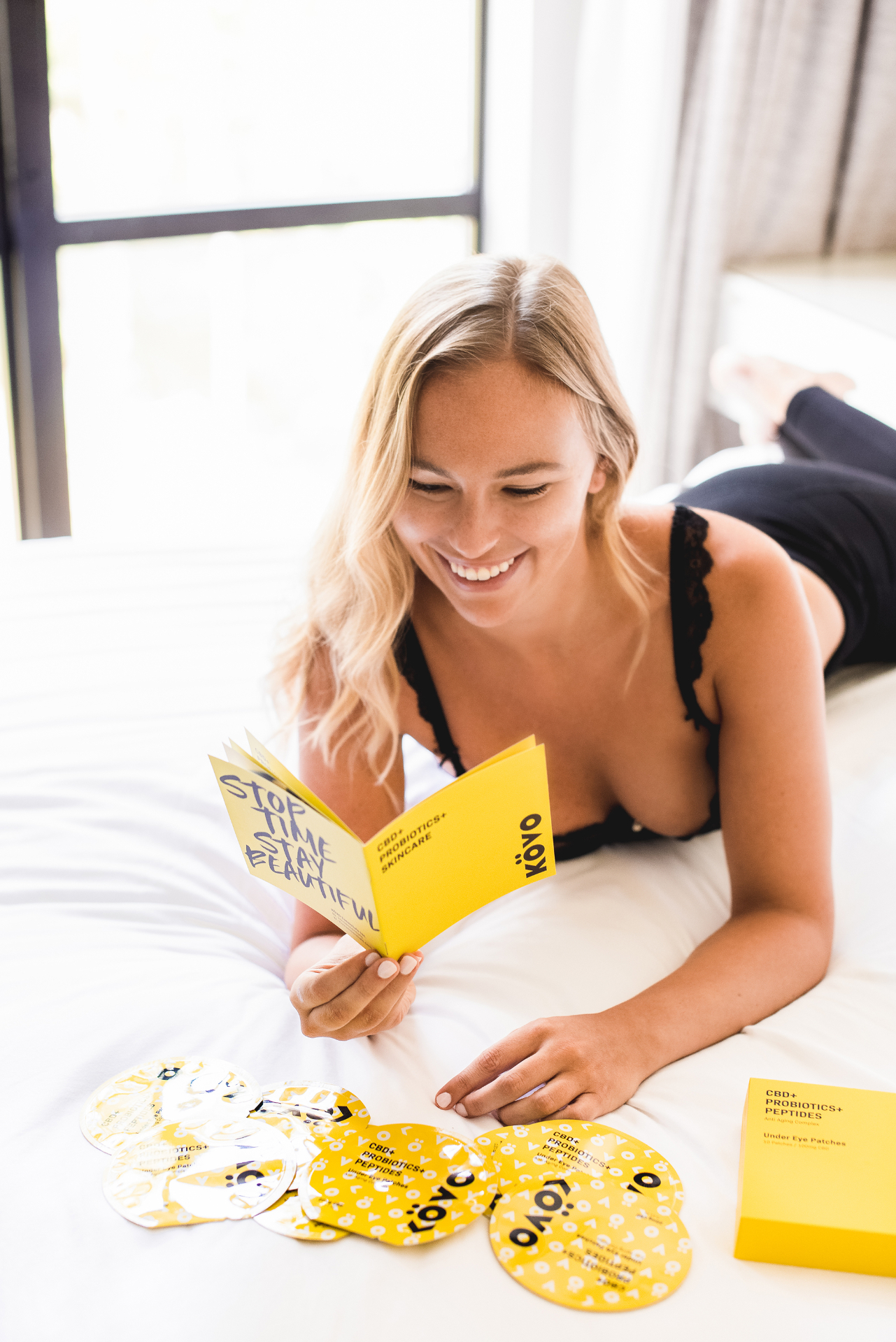
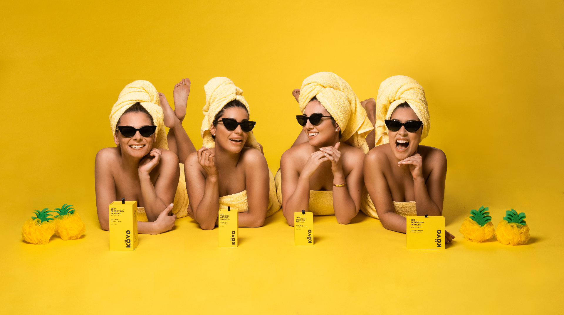
We anchored the identity around a confident KÖVO wordmark and committed to a single, ownable color: a saturated yellow used edge-to-edge across every vessel and carton. Frosted yellow glass for the actives, matte yellow board for the secondary packaging, and a stripped-back ingredient-led label grid. The result is a system that reads as one bold house from a shelf, a Vogue page, or a bathroom counter.
Process
Four phases, one retail-ready system.
01
Discovery & Strategy
Founder workshop, deep audit of the CBD skincare shelf, and a clear positioning brief: a premium NYC house ready for Sephora — not a wellness brand wearing a skincare costume.
02
Brand Identity System
Wordmark, ownable yellow palette, type system, and a strict ingredient-forward label grid — engineered so every future SKU plugs into the same shelf logic.
03
Vessel-First Packaging
Frosted yellow glass for serums and mists, matte yellow secondary cartons for the full range — all factory-ready, all built to read as one bold house in 3D, not just on screen.
04
Retail & Editorial Imagery
Editorial product still life and on-model imagery designed to slot into Sephora pitch decks, paid ads, and press features — including the French Vogue placement that followed launch.
“They gave us a brand so loud and so specific that retailers and editors couldn't ignore it — Sephora and French Vogue happened in the same year.”