
Case study · 2024
La Suite Skincare
Clinical-grade skincare with quiet, luxurious restraint.
- Client
- La Suite Skincare
- Location
- Greenwich, CT
- Services
- Brand IdentityPackagingAds
- Year
- 2024
Overview
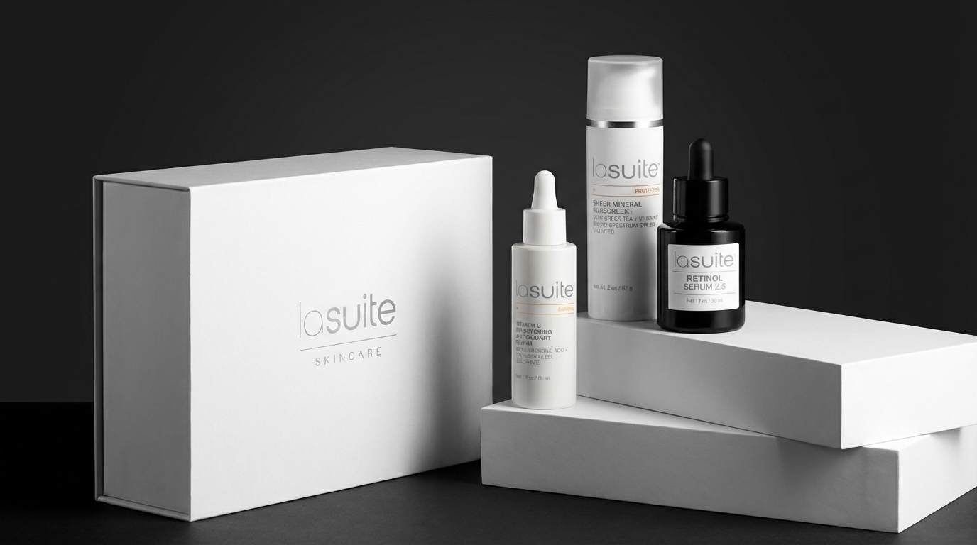
La Suite came to us with three hero products and the ambition to build a serious clinical skincare line out of Greenwich. Over two years we grew that into a 30+ SKU system — every bottle, carton, ad, and social post on the same restrained, silver-on-white wavelength.
The challenge
Most clinical skincare brands either lean cold-pharmacy or over-design themselves into wellness. La Suite needed a system that could carry serums, sunscreens, eye creams, and body care under one quiet visual language — and scale from a launch range of three to a full 30-SKU shelf without losing the original feeling.
Our approach
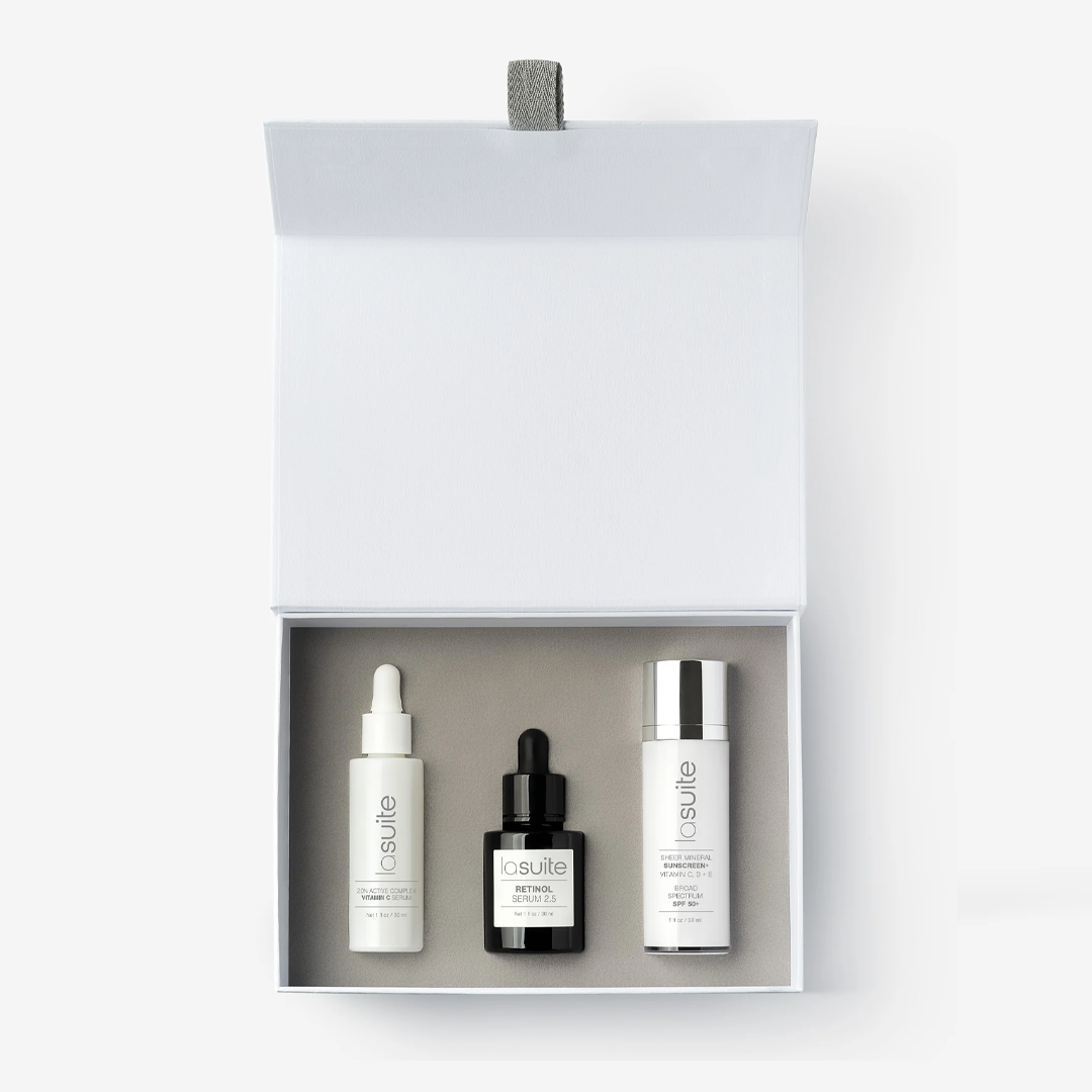
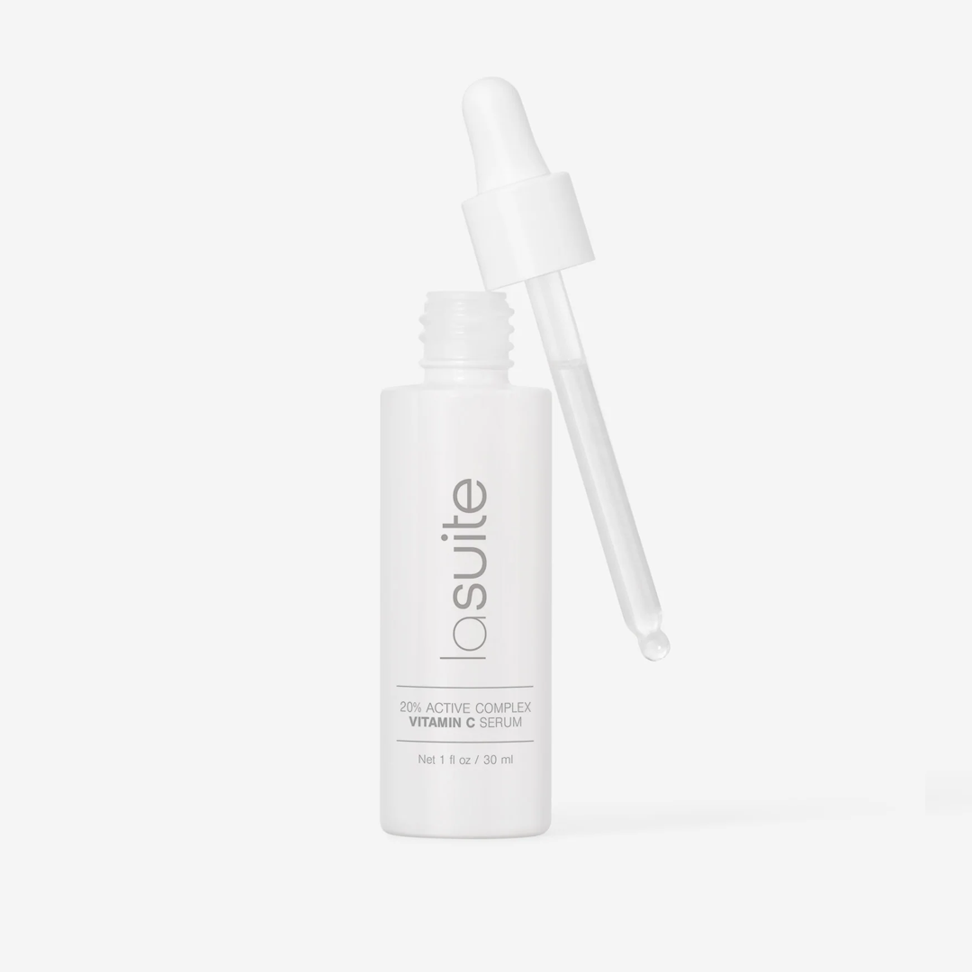
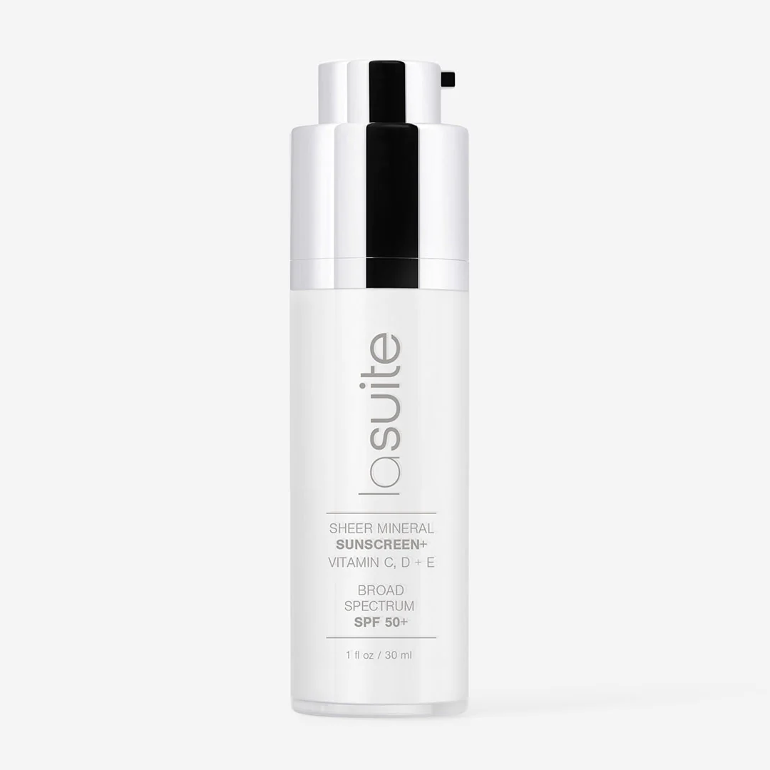
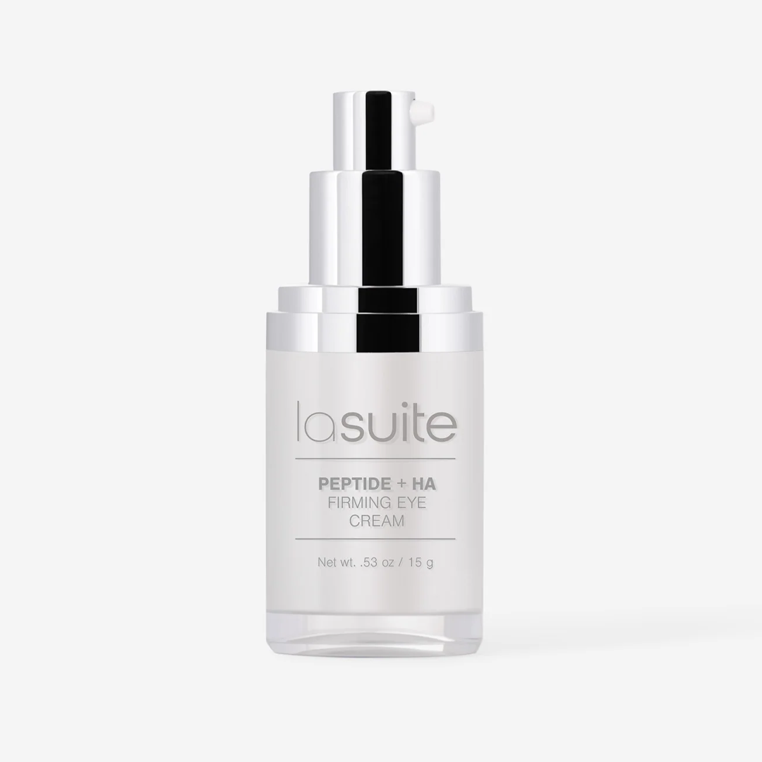
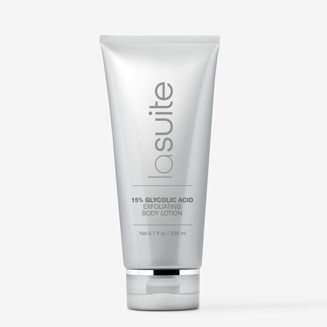
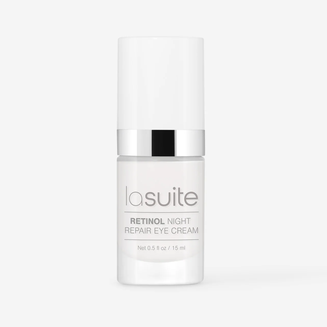
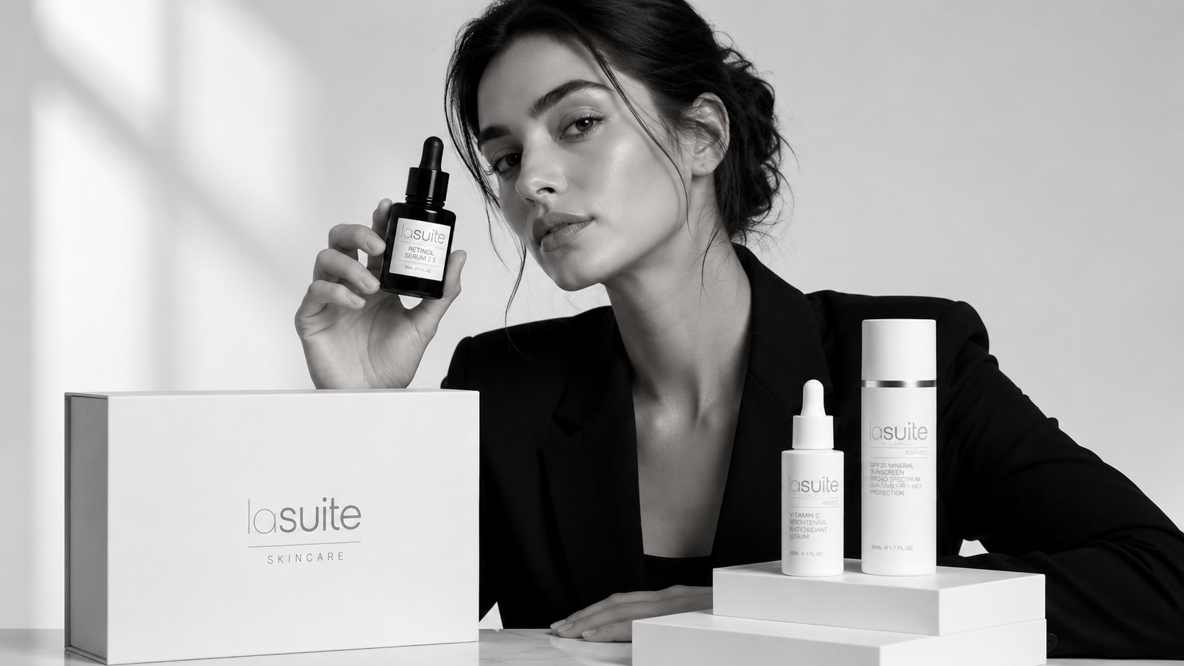
We built the identity around a single silver-on-white treatment, anchored to a precise wordmark and a strict label grid. Every new SKU plugs into the same template: vertical logo, ingredient name, dosage callout. Ad and social work uses the same restraint — black backdrops, soft product light, no extra graphic furniture.
Process
Four phases, one retail-ready system.
01
Discovery & Strategy
Positioning workshop, competitive audit against the clinical-luxury shelf, and a clear definition of the silver-on-white visual logic the brand would scale into.
02
Brand Identity System
Wordmark, label grid, type system, and a cool silver + warm gray palette — built as a packaging template any future SKU could plug into without redesign.
03
Packaging at Scale
Applied the system across 30+ SKUs in two years: serums, sunscreens, eye creams, body care, gift boxes, and secondary cartons — all factory-ready.
04
Ads & Social
Editorial product photography direction, paid ad creative, and a monthly social cadence — all kept on the same restrained, product-first wavelength.
“They built a system that's let us launch a new product almost every month without ever looking off-brand.”